3.27.13: DON’T FORGET THE CASSETTE
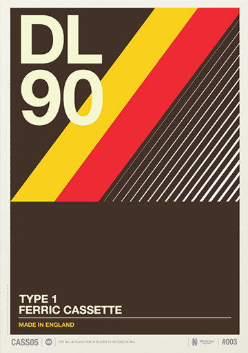
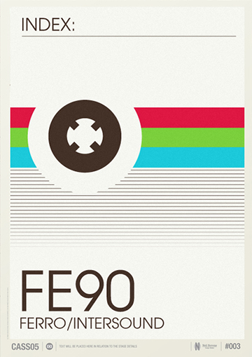
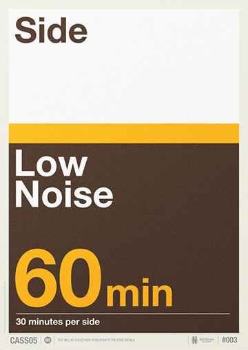
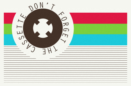 London-based graphic designer Neil Stevens has taken the distinctive look of classic Jcards, those commonly paired with 60, 90, and 120-minute blanks, head-cleaners, and loop tapes for early answering machines, and is using them as inspiration for his new series of prints “Don’t Forget The Cassette“.
The colors for these inlays were usually RGB and mimicked a TV test pattern, or flooded with browns, yellows, and oranges much like the Brady Bunch’s kitchen. They often had coextending lines, heavy block typography, and signifiers for details of the tapes such as bias, side, and length. All aspects that Stevens has captured wonderfully in the eight prints he’s designed for the series.
It was actually not cassettes, but another format all together that got the ball rolling (can I say “spools spinning” or would that be going too far?) on this project. As Stevens expressed on his site “…there’s a lot of talk about vinyl and the growing revival of that format. This lead me to explore the graphics and layout of cassette inlay designs”.
As of right now these wall prints are for Neil’s personal stash, but if there is positive feedback and interest they will be made available for purchase. You can check out the series in full, and the rest of Neil’ incredible work, on his site: https://www.crayonfire.co.uk/. – MH